In [1]:
%matplotlib inline
from matplotlib import pyplot as plt
import pandas as pd
import numpy as np

SMALL_SIZE = 16
MEDIUM_SIZE = 16
BIGGER_SIZE = 20

plt.rc('font', size=SMALL_SIZE)          # controls default text sizes
plt.rc('axes', titlesize=SMALL_SIZE)     # fontsize of the axes title
plt.rc('axes', labelsize=MEDIUM_SIZE)    # fontsize of the x and y labels
plt.rc('xtick', labelsize=SMALL_SIZE)    # fontsize of the tick labels
plt.rc('ytick', labelsize=SMALL_SIZE)    # fontsize of the tick labels
plt.rc('legend', fontsize=SMALL_SIZE)    # legend fontsize
plt.rc('figure', titlesize=BIGGER_SIZE)  # fontsize of the figure title
How I'll solicit feedback from you:
- I'll verbally ask and see if I can read your body language.
- I'll post questions and polls on #in_class. Reaction emojis are super helpful.
If you have a question in class:
- Keep your microphone muted until you are called on.
- Option 1: Write your question in
#in_class. Other students: feel free to react to other's questions. - Option 2: Raise your little blue hand thing.
A scientific programmer:
- Uses programming as a means to the end of solving an interesting scientific problem
- Uses computing to think better more precisely
Programming is hard to learn because it requires two, completely different, skills:
- Syntax and language: How do I convince the stupid computer to do what I want it to do?
- How do I make it print stuff?
- What's the difference between an array and a list?
- Algorithmic thinking: How do I formulate a problem in a crystal clear, tractable, and logical fashion?
Approach
- Students learn material by reading, modifying, and then writing code. (Syntax and data structures should be taught through use, not memorization.)
- Exercises focus on puzzles and tasks.
- Students should work in assigned pairs with partners of different skill levels.
- The inexperienced student might be thinking: "Oh no! I'll look like a moron with this super smart person."
- My answer: "Use them as a resource to get better."
- The experienced student might be thinking: "I'm going to be stuck with someone who will just slow me down!"
- My answer: "Having to explain stuff helps you really understand. And, because the homework sets are task and problem oriented, you can always find a way to push yourself in this course."
Approach
- Students learn material by reading, modifying, and then writing code. (Syntax and data structures should be taught through use, not memorization.)
- Exercises focus on puzzles and tasks.
- Students should work in assigned pairs with partners of different skill levels.
An example:
Predict what this code will do.
In [2]:
x = 5
print(x > 2)
Summarize
What does x < y do? What does it spit out?
In [ ]:
Modify
Change the following cell so it prints False
In [3]:
x = 20
print (x < 2)
Implement
Write code that will only print x if x is more than 100.
Finally
We then discuss this as a class to reveal the key ideas.
This is not induction with no instruction.
https://harmsm.github.io/scientific-computing/cheat-sheet.html
Don't worry, this will become clearer as we go.
Questions?
The syllabus
How do I get help?
- Post questions on
#help - Office hours (http://whenisgood.net/kbfshr3)
- https://harmsm.github.io/scientific-computing/cheat-sheet.html
- google...
What do I need to do by Wednesday?
- Configure your computing environment
- Download chapter_00
- Fill out the survey if you are one of the five people who hasn't.
In [10]:
df = pd.read_excel("class-list.xlsx")
df = df[np.array(np.logical_not(np.isnan(df.raw_score)))]
In [11]:
plt.hist(df.raw_score)
plt.xlim(0,20)
plt.xlabel("score")
plt.ylabel("counts")
plt.title("2020, distribution of scores")
Out[11]:

In [12]:
plt.plot(df.python,df.score,"o")
fit = np.polyfit(df.python,df.score,1)
plt.plot(np.arange(5),fit[0]*np.arange(5) + fit[1],"-")
plt.title("People are pretty good at self-evaluation")
plt.xlabel("personal evaluation, python skill")
plt.ylabel("score on python quiz")


SStot = np.sum((df.score - np.mean(df.score))**2)
SSreg = np.sum((df.python*fit[0] + fit[1] - df.score)**2)
print("R2:",SSreg/SStot)

How people compute
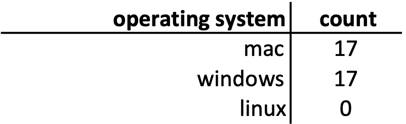
|
|
|---|
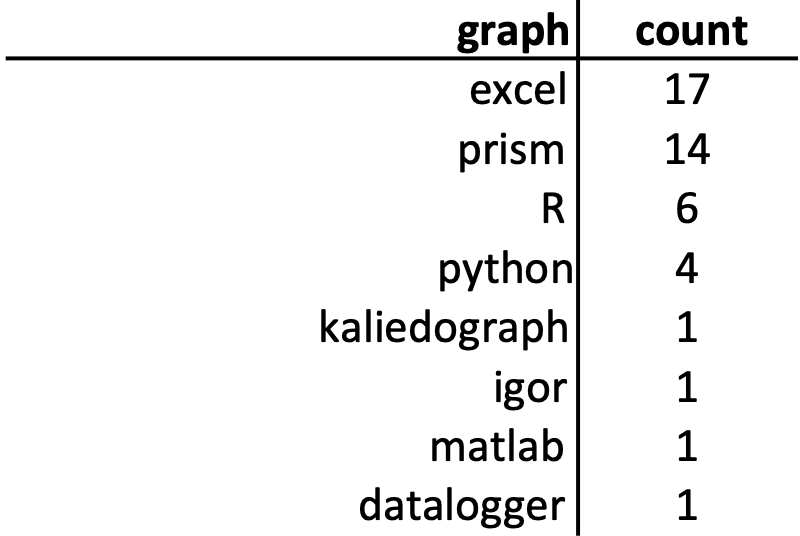
Previous experience
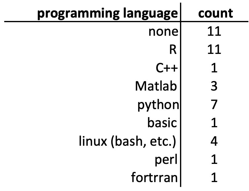
|
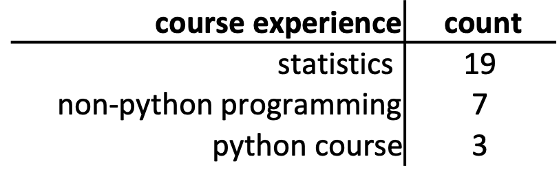
|
|---|
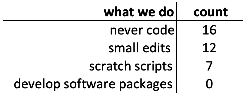
What kinds of computing do we do?
What do people hope to learn?
- basic, practical programming
- learn enough to understand canned programs
- troubleshoot problems
- switch from matlab
- topics: image analysis, machine learning, high-throughput sequencing, statistics
- Only about 1/2 of people here have specific research question
What helps poeple learn?
- clear expectations
- visual and interactive learning
- assigned reading
- notes in advance, notes available for review
- lecture, not just reading or pre-recordeded video
- examples, practice, repetition
- assignments with deliverables, specific tasks, projects
- time to think/work independently
- combination of independent and group work
What hurts people's learning?
- unclear objectives, changing due dates
- time limitations
- going too fast
- assumption of previous knowledge, acronyms
- inability to find reference material
- no visual material
- inductive learning
- outside stress (looking at you, COVID-19)
What do I need to do by Wednesday?
- Configure your computing environment
- Download chapter_00
- Fill out the survey if you haven't already